Email newsletters in 2026 are no longer just “weekly updates” or promotional blasts. They’ve become relationship-driven content channels that help brands, creators, and companies build trust, deliver value, and stay top-of-mind in an increasingly noisy digital environment.
What’s changed is simple but powerful: people don’t tolerate generic emails anymore. They expect relevance, personality, and usefulness in every message they open. Research and industry trends show that inboxes are now more competitive than ever, and engagement depends heavily on personalization, timing, and clarity of value rather than volume or design complexity .
Modern newsletters succeed when they feel like a curated experience instead of a broadcast—something the reader actually wants to open, not something they tolerate.
What is an email newsletter?
An email newsletter is a regularly sent email that delivers curated content, updates, or insights to a subscriber list. It can be informational, educational, promotional, or entertainment-focused—but its core purpose is always the same:
To build a consistent, ongoing relationship with an audience through email.
In 2026, newsletters have evolved far beyond simple updates. They often function as:
- Content distribution channels (blogs, news, insights)
- Brand storytelling platforms
- Community engagement tools
- Sales and conversion funnels
- Personal creator media outlets
Unlike social media, newsletters are owned channels, meaning the sender controls distribution, audience access, and messaging without relying on algorithms or feeds .
This ownership is one of the biggest reasons newsletters continue to grow in importance despite the rise of newer platforms.
Elements of an effective email newsletter
A successful newsletter in 2026 isn’t defined by how “pretty” it looks—it’s defined by how well it keeps attention and drives engagement. The most effective newsletters consistently share a few core elements:
Engaging subject lines
Subject lines are still the single most important factor in email open rates. In 2026, the best-performing subject lines tend to be:
- Short and curiosity-driven
- Personalized or behavior-based
- Focused on a single idea or benefit
- Written in a natural, human tone
Instead of clickbait, modern newsletters rely on relevance and specificity. AI tools now help optimize subject lines based on user behavior and predicted engagement, but the best results still come from human creativity paired with data insights .
Well-designed email newsletter templates
Design in 2026 is less about visual complexity and more about clarity and usability.
High-performing newsletters follow these principles:
- Mobile-first layout (most readers open emails on mobile)
- Clean typography with strong hierarchy
- Simple sections instead of dense blocks
- Clear visual separation between ideas
- Fast loading and lightweight formatting
Many modern newsletters intentionally avoid over-designed visuals because simplicity improves readability and engagement.
Focused, relevant topics
One of the biggest mistakes newsletters still make is trying to cover too much in a single email.
Effective newsletters focus on:
- One main idea or theme per email
- Content tailored to specific audience segments
- High relevance based on subscriber behavior or interests
- Consistency in tone and subject matter
In 2026, relevance beats volume. A smaller, highly engaged audience consistently outperforms large but disengaged lists.
Skimmable copy with engaging content
People don’t read newsletters word-for-word anymore—they scan them.
That means great newsletters are built for scanning:
- Short paragraphs (2–3 lines max)
- Bullet points for quick digestion
- Clear subheadings
- Bold highlights for key insights
- Conversational tone instead of formal writing
The goal is to make content easy to absorb in seconds, while still offering depth for those who want to read further.
Strong calls to action (CTAs)
Every effective newsletter guides the reader toward a next step—but not aggressively.
In 2026, strong CTAs are:
- Clear but not pushy
- Contextually placed within the content
- Focused on one action per email
- Value-driven (“Read more,” “Try this,” “See breakdown”) rather than sales-heavy
The best newsletters treat CTAs as a natural continuation of the content, not a disruption.
Best email newsletter examples
In 2026, the best email newsletters aren’t just “informative”—they’re highly readable, personality-driven, and built around strong editorial systems. What separates great newsletters from forgettable ones is a mix of clear voice, strong curation, consistent structure, and reader-first design.
Below are standout examples and what makes each of them work so effectively.
1. Morning Brew
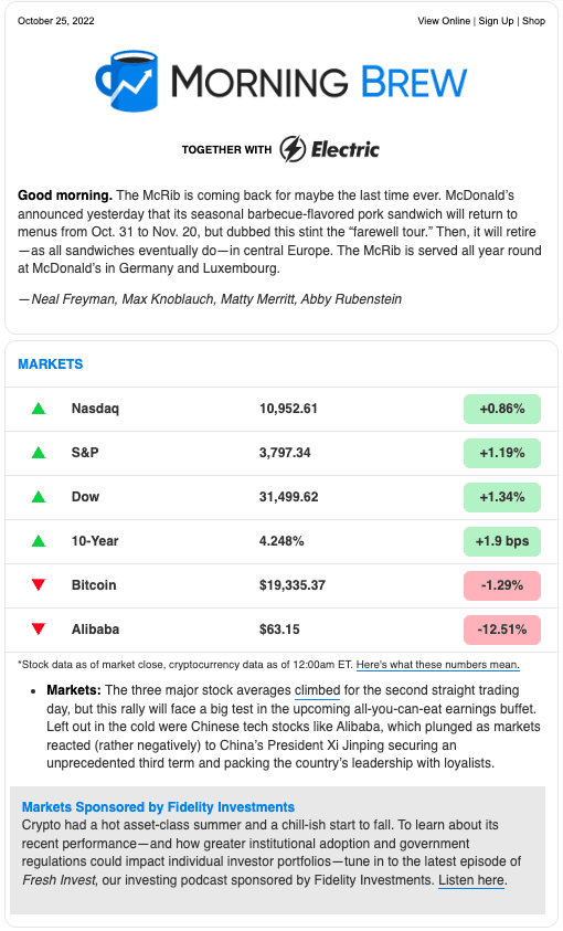
Morning Brew succeeds because it turns business news into something fast, witty, and extremely easy to consume.
Instead of overwhelming readers with dense reporting, it delivers:
- Short, punchy summaries of major business and market news
- A conversational tone that feels like a smart coworker explaining the day
- Strong structure with clearly separated sections
- Scannable formatting using bullets, headers, and highlights
Its biggest strength is voice consistency. Every email feels like it comes from the same personality, which builds habit and trust over time. Readers don’t just “read” it—they expect it daily, often in the morning routine.
It also uses smart engagement mechanics like humor, occasional quizzes, and tightly edited storytelling to keep attention high without increasing length.
2. New York Times Cooking
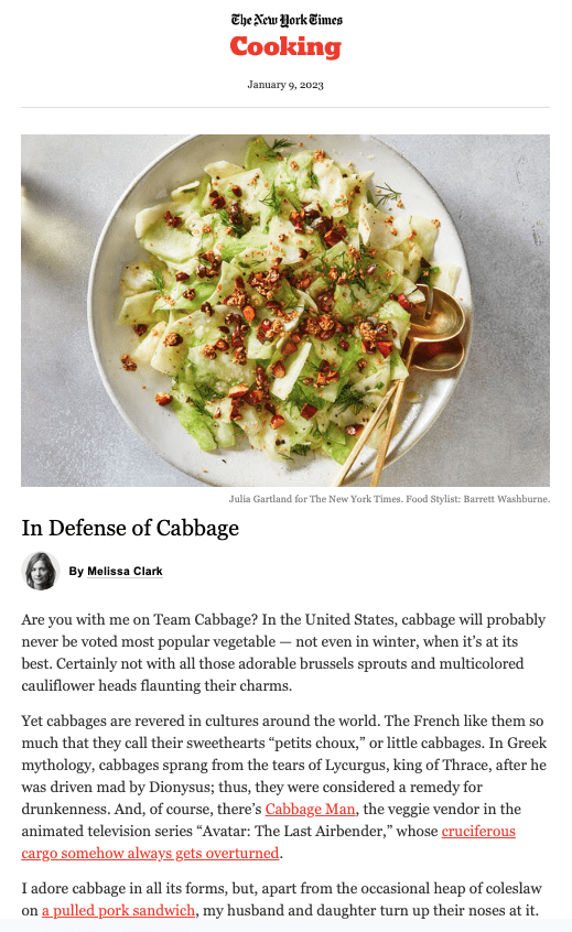
New York Times Cooking stands out because it blends utility + storytelling + sensory appeal.
Instead of acting like a typical recipe dump, it:
- Uses a warm, first-person editorial tone
- Introduces recipes with context and personal narrative
- Focuses heavily on visual appeal (food photography is central)
- Lets readers quickly skip to recipes if they prefer less reading
What makes it effective is its ability to serve two types of readers at once:
- Those who want inspiration and storytelling
- Those who just want quick, practical recipes
This dual-layer structure increases engagement without sacrificing simplicity.
3. Robinhood Snacks
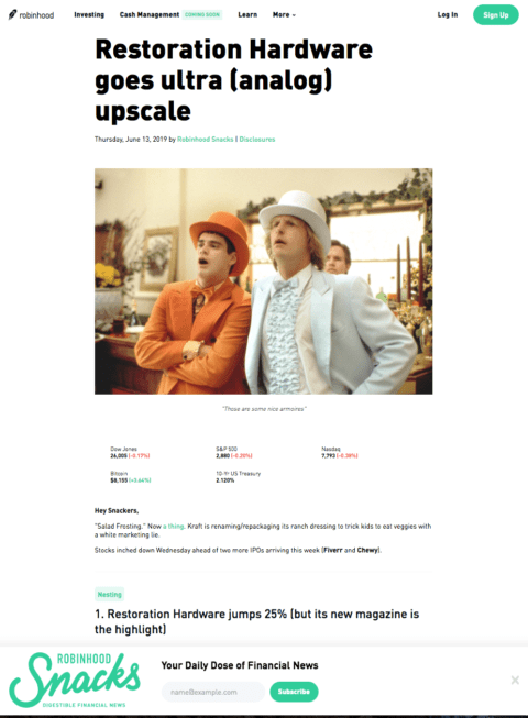
Robinhood Snacks works because it makes finance feel simple, fast, and unintimidating.
Instead of traditional financial jargon, it focuses on:
- Short, digestible explanations of market news
- A light, sometimes humorous tone
- Clean formatting designed for quick scanning
- Minimal friction between insight and understanding
Its strength is accessibility. It lowers the barrier for readers who don’t normally follow finance but still want to stay informed. The newsletter doesn’t try to impress—it tries to clarify.
4. Accept Cookies
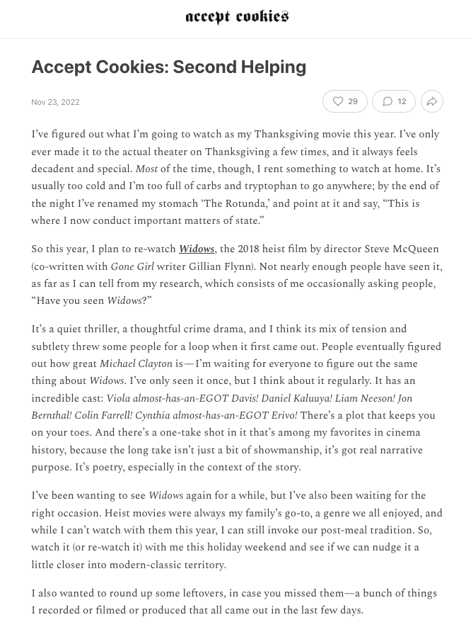
Accept Cookies is a great example of how a text-heavy newsletter can still feel engaging when personality is strong.
It stands out because:
- It’s highly personal and voice-driven
- It focuses on “small delights” like recommendations and cultural commentary
- It doesn’t rely heavily on visuals or design
- It feels like reading a curated note from a trusted creator
Unlike many modern newsletters that depend on design systems, this one proves that strong editorial voice can replace visual complexity entirely.
Its success comes from authenticity—readers feel like they are getting recommendations from a real person, not a brand.
5. Into the Gloss
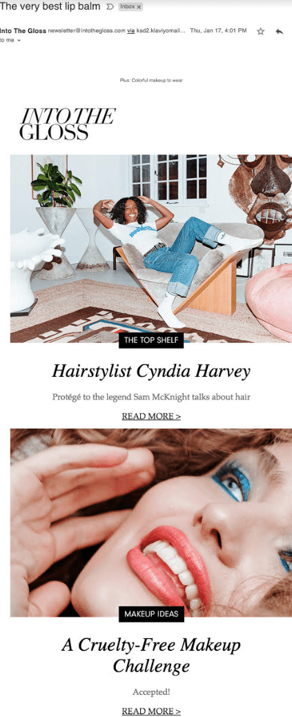
Into The Gloss thrives because it builds a community-driven beauty editorial experience rather than a traditional promotional email.
Its strengths include:
- Deep storytelling around beauty routines and products
- Interviews and real-user perspectives instead of generic advice
- Strong alignment between content and audience identity
- Editorial consistency that feels like a magazine, not marketing
It succeeds because it doesn’t just sell beauty—it explores it. Readers stay engaged because the content feels culturally relevant, not transactional.
6. Quartz Daily Brief
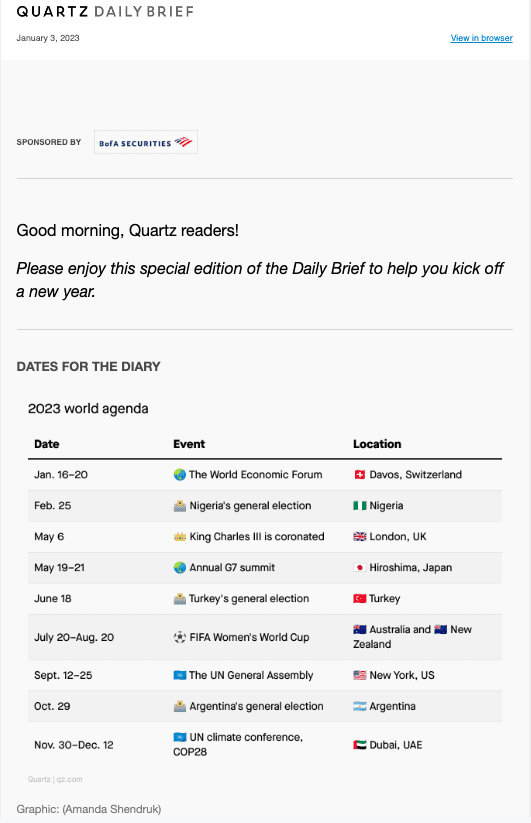
Quartz Daily Brief stands out because it prioritizes clarity, structure, and efficiency over everything else. It’s designed for readers who want to understand the most important global business and economic news in just a few minutes.
What makes it effective is its highly organized editorial format. Each email typically breaks down content into predictable, scannable sections such as key headlines, context-driven summaries, and quick insights. This structure reduces cognitive load, making it easy for busy professionals to absorb information quickly.
Another major strength is its neutral, analytical tone. Instead of trying to entertain, it focuses on helping readers “get informed fast,” which builds trust with an audience that values accuracy and efficiency. The writing avoids unnecessary fluff and sticks to essential insights.
Quartz also uses its newsletter as a core distribution and engagement channel, meaning the format is deeply integrated with its editorial strategy rather than treated as a secondary product. This consistency reinforces habit formation among readers who rely on it daily.
Overall, Quartz Daily Brief works because it treats the newsletter like a professional intelligence briefing rather than a casual email.
7. Harry’s Newsletter
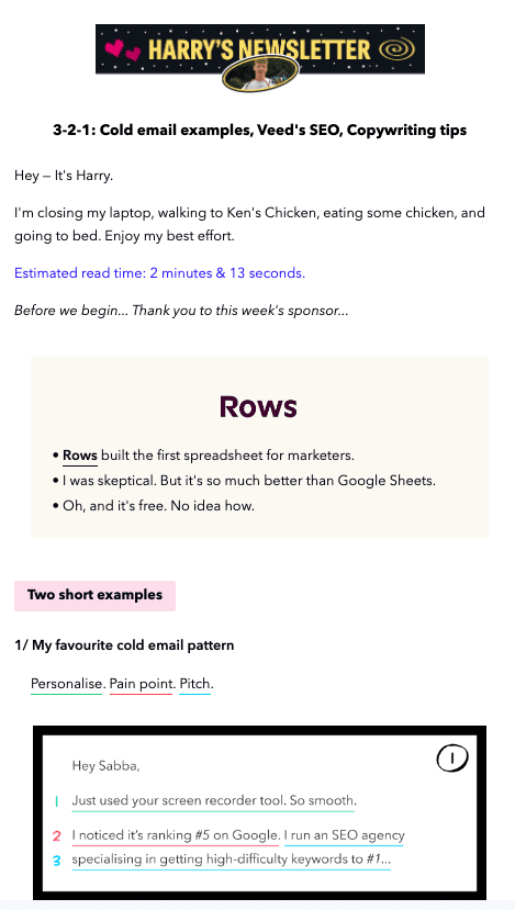
Harry’s Newsletter is successful because it blends marketing education with real-world examples in a highly visual and digestible format.
Instead of long explanations, it focuses on:
- Short breakdowns of marketing campaigns
- Real examples of copywriting techniques
- Screenshots and visuals that do most of the teaching
- A fast, scrollable reading experience
Its biggest strength is learn-by-example content design. Readers don’t just read about marketing—they see it in action, which improves retention and makes insights easier to apply.
The tone is also intentionally light and approachable. Even when discussing advertising or copywriting principles, it avoids jargon and keeps explanations simple.
This newsletter works because it respects the reader’s time and attention, delivering high-value insights in under a few minutes per issue.
8. Girls’ Night In
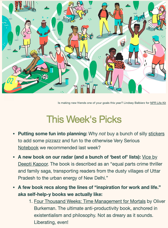
Girls’ Night In succeeds because it is built around a very clear emotional positioning: comfort, relaxation, and intentional downtime.
Unlike many newsletters that focus on productivity or urgency, this one leans into:
- Cozy cultural recommendations (books, podcasts, essays)
- A calm, reassuring writing tone
- Soft visual identity and soothing design
- A sense of community and shared experience
The content feels personal and curated, almost like a recommendation from a close friend rather than a media brand. This emotional connection is a key driver of loyalty.
Another important factor is intentional pacing. The newsletter is designed to be read slowly, encouraging readers to pause rather than rush through it. This makes it feel different in crowded inboxes dominated by fast, transactional content.
It works because it sells not just content, but a feeling—rest, comfort, and balance.
9. Sugardoh
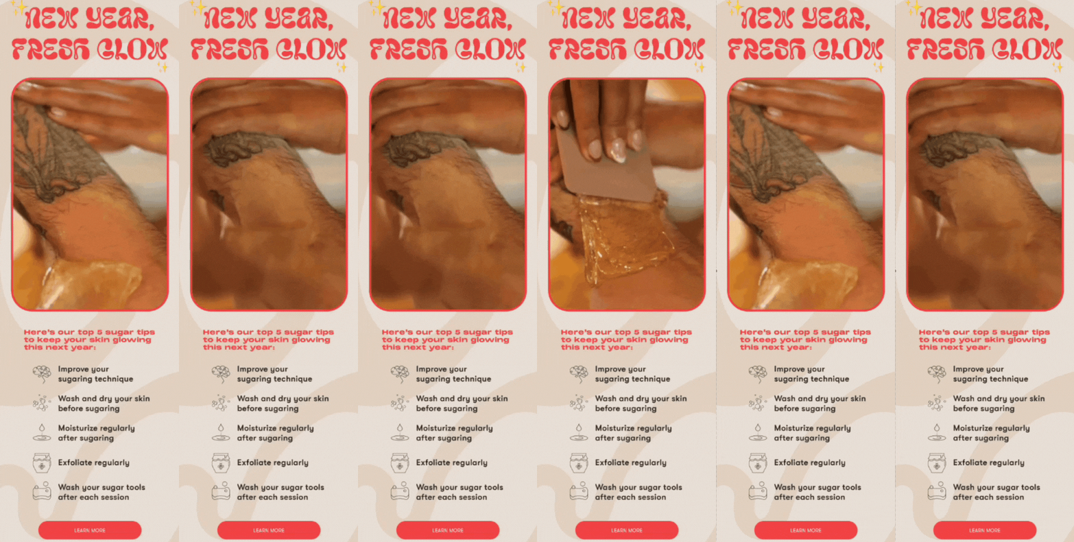
Sugardoh’s newsletter is effective because it combines strong visual branding with practical, product-driven storytelling.
It stands out through:
- Bold, recognizable visual identity (colors, fonts, and playful design)
- Short, skimmable sections that prioritize clarity
- A mix of education and product promotion
- Engaging visual elements like GIFs and icons
Instead of separating marketing from education, Sugardoh blends them naturally. Readers learn about hair removal techniques, skincare tips, or product usage while also being introduced to the brand’s offerings.
A key strength is brand consistency across every email touchpoint. The newsletter doesn’t feel like a separate channel—it feels like an extension of the product experience itself.
It works because it balances utility + personality + subtle promotion without overwhelming the reader.
10. theSkimm
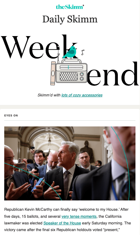
theSkimm is one of the most recognizable newsletter models because it redefined how news can be delivered in email form.
Its success comes from a few core principles:
- A conversational, friend-like tone that makes news feel approachable
- Highly simplified summaries of complex events
- Strong consistency in daily delivery timing
- A clear focus on busy readers who want quick updates
The newsletter’s format breaks down major stories into short, digestible explanations, often using a casual voice that feels more like a conversation than traditional reporting. This makes it especially effective for readers who feel overwhelmed by news overload.
Another major strength is its routine integration. By sending emails early in the day and maintaining consistency, it becomes part of readers’ daily habits—almost like a morning briefing.
Ultimately, theSkimm works because it solves a simple problem extremely well: it filters overwhelming news into something readable, relatable, and fast to consume.
11. The Margins
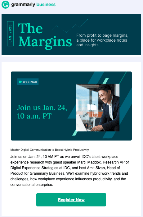
The Margins is a strong example of how a brand-driven editorial newsletter can successfully balance content marketing and product relevance without feeling overly promotional.
One of its biggest strengths is its clean, cohesive visual identity. Every issue feels structured and intentional, with consistent use of brand colors, typography, and spacing. This visual consistency helps readers instantly recognize the newsletter in their inbox, which is crucial for retention in 2026 where attention spans are shorter than ever.
Content-wise, The Margins does something particularly effective: it blends thought leadership + practical insights + subtle product integration. Instead of pushing sales messages directly, it focuses on workplace trends, productivity insights, and research-backed ideas, while naturally tying in its core product ecosystem.
Another key factor is its clear content hierarchy. Articles are presented in a way that allows readers to quickly scan headlines and decide what to engage with. This supports modern reading behavior, where most users skim before committing.
Overall, it works because it positions itself as a valuable industry resource first, and a brand newsletter second.
12. Really Good Emails
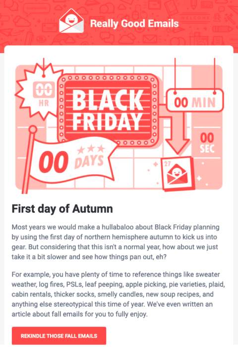
Really Good Emails stands out because it doesn’t behave like a typical newsletter—it acts as a curated learning hub for email marketers and designers.
Its main strength is content curation at scale. Instead of only producing original content, it collects and showcases high-performing email examples from across industries. This makes it extremely valuable for professionals who want quick inspiration without searching manually.
The newsletter also excels in tone and personality. It maintains a conversational, slightly witty voice that makes even technical email marketing topics feel engaging and approachable. This tone is especially important for audiences like designers, copywriters, and marketers who consume a lot of similar content.
Another key advantage is its minimal but effective design system. It avoids clutter and focuses on readability, using strong spacing, simple layouts, and visually distinct examples to highlight key ideas.
It works because it becomes a daily inspiration tool rather than just another marketing email.
13. New York
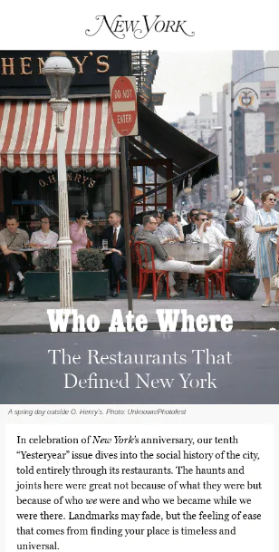
The New York newsletter succeeds because it mirrors the strengths of traditional editorial publishing: storytelling, visual sophistication, and strong curation.
One of its defining features is its high-quality editorial tone. Instead of overwhelming readers with information, it selects a few meaningful stories and presents them with context, narrative depth, and clarity. This makes each email feel like a carefully curated reading experience rather than a news dump.
It also uses strong visual storytelling, often incorporating photography that supports the narrative rather than distracting from it. This creates a magazine-like experience inside the inbox, which is rare in modern email design.
Another reason it works is its focus on selective content distribution. Rather than trying to cover everything, it emphasizes quality over quantity—choosing fewer stories but presenting them in a more thoughtful and engaging way.
This newsletter works because it delivers a premium editorial experience in a simple email format, appealing to readers who value depth and storytelling.
14. Orangewood Guitars
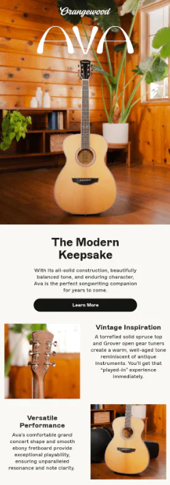
Orangewood Guitars has one of the most effective product-focused newsletter strategies because it turns simple product promotion into a lifestyle-driven storytelling experience.
Each email typically highlights a single guitar or small collection, supported by high-quality visuals that emphasize craftsmanship, design, and aesthetic appeal. This allows the product to become the hero of the email without overwhelming the reader with too much information.
A major strength is its minimal but intentional copywriting. Instead of long descriptions, it uses short, emotionally resonant text that connects the product to music, creativity, and aspiration. This helps readers imagine the product in their own life.
It also uses clean layouts and strong visual hierarchy, making it easy for users to focus on the product image and call-to-action without distraction.
It works because it doesn’t just sell guitars—it sells a creative identity and lifestyle around music.
15. Stanley
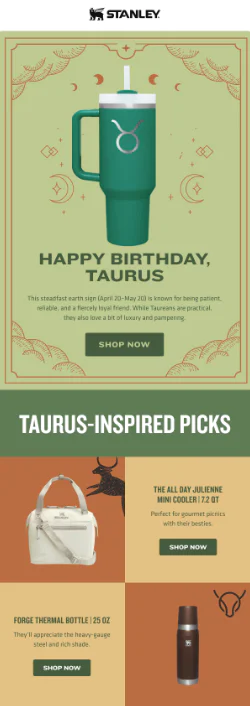
Stanley’s newsletter is effective because it transforms a simple product category (drinkware) into a strong lifestyle and community-driven brand experience.
One of its biggest strengths is its visual-first storytelling approach. Emails typically highlight bold product imagery in real-life settings, showing the product being used in everyday moments like travel, fitness, or outdoor activities. This helps customers emotionally connect with the product.
Another key factor is its strong brand consistency. The tone, visuals, and messaging all reinforce durability, adventure, and practicality—core brand values that resonate across all campaigns.
Stanley also does a great job of cross-promoting product variations without overwhelming the reader. Instead of listing many items, it carefully curates a small selection, making each product feel more intentional and desirable.
Finally, its newsletters often tap into seasonal relevance and lifestyle trends, which increases engagement by making content feel timely and useful.
It works because it turns a basic product into a symbol of lifestyle identity and everyday utility.
16. Therabody
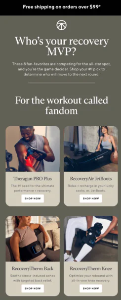
Therabody’s newsletter is a strong example of how a brand can use email to create a two-way conversational experience instead of a one-way product broadcast.
One of its biggest strengths is its focus on engagement-driven storytelling. Instead of simply listing products, the emails often educate readers on wellness routines, recovery science, and lifestyle habits. This positions the brand as a trusted authority in the wellness space rather than just a seller of devices.
Visually, Therabody uses a clean, modern, and high-contrast design system. Product imagery is sharp and intentional, often placed in real-life usage contexts that help subscribers understand both function and benefit. This improves product comprehension and purchase confidence.
Another key factor is its balanced CTA strategy. Calls-to-action are present but not overwhelming, typically tied directly to the content (e.g., learning more, exploring routines, or discovering solutions). This avoids the aggressive sales tone that often reduces engagement in promotional emails.
Overall, Therabody works because it blends education, lifestyle relevance, and product storytelling into a single cohesive experience.
17. Help Scout
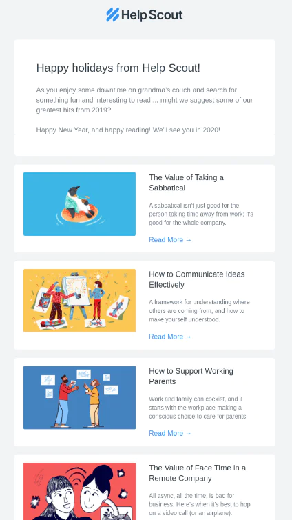
Help Scout’s newsletter is highly effective because it prioritizes clarity, simplicity, and value-first content delivery over design complexity.
Its structure is intentionally minimal, often starting with a short introduction followed by curated content such as blog posts, customer support insights, or industry advice. This makes it extremely easy to scan, which is critical for modern readers who prefer fast consumption over long-form reading inside emails.
A major strength is its content curation strategy. Instead of trying to create entirely new content for every email, Help Scout repackages its best resources in a way that feels fresh and relevant. This reinforces the brand as a consistent knowledge hub for customer service and support teams.
The design also plays a big role in its effectiveness. It uses clean spacing, minimal visual distractions, and a strong hierarchy of information, ensuring readers focus on the message rather than decorative elements.
Help Scout succeeds because it understands a key principle of modern newsletters: less noise, more value.
18. Urban Outfitters
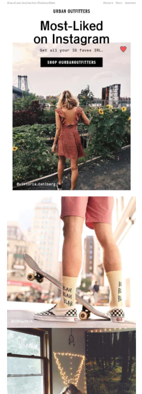
Urban Outfitters’ newsletter stands out because it turns email into a cultural and community-driven shopping experience rather than a traditional promotional channel.
One of its strongest strategies is its use of user-generated content and social proof. Instead of relying only on branded product shots, it often highlights how real customers or social audiences engage with its products. This builds authenticity and increases relatability.
The brand also excels at trend-driven storytelling. Emails are often aligned with cultural moments, seasonal aesthetics, or emerging fashion trends, making them feel timely and relevant rather than static or generic.
Another important factor is its strong visual merchandising approach. Products are presented in curated “drops” or styled collections instead of long catalogs, which makes browsing feel more intentional and editorial.
According to marketing analysis, Urban Outfitters has also used advanced segmentation and personalized campaigns to improve engagement and conversion rates significantly, reinforcing how important data-driven targeting is to its email success .
It works because it merges fashion editorial, social culture, and e-commerce into one seamless email experience.
19. Canva
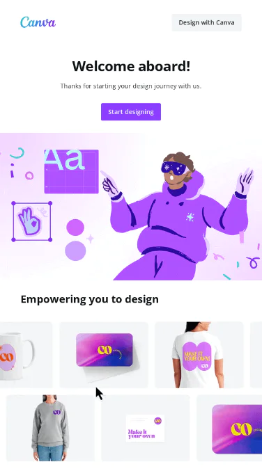
Canva’s newsletter is highly effective because it is a perfect extension of its core product philosophy: simplicity, creativity, and usability at scale.
Every email is designed to showcase what users can immediately create inside the platform. Instead of abstract messaging, Canva focuses on real examples of templates, designs, and use cases, such as presentations, social media posts, merchandise designs, or marketing assets.
A key strength is its visual-first communication style. The emails are heavily image-driven, which aligns with Canva’s identity as a design platform. This helps users instantly visualize what they can achieve using the product.
Another important factor is clear inspiration-to-action flow. Each section typically inspires users with design ideas and then quickly directs them toward templates or tools they can use right away. This reduces friction between inspiration and execution.
Canva also maintains strong brand consistency across tone, color, and layout, reinforcing familiarity and trust over time.
It works because it turns every email into a mini product experience that demonstrates value instantly instead of describing it.
Frequently asked questions
Q. What makes a good email newsletter?
A good email newsletter in 2026 is defined less by design complexity and more by clarity, relevance, and consistency. The best newsletters deliver a single, focused value in every send—whether that’s insight, entertainment, or a useful update.
Key traits include:
- A clear purpose per email (one main idea instead of multiple competing topics)
- Strong, curiosity-driven subject lines that match the content
- Content that feels personal and human, not overly corporate
- A structure that is easy to scan on mobile
- A single, obvious takeaway or action for the reader
Modern newsletters perform best when they feel like a useful habit rather than a marketing broadcast. Readers engage more when they trust that every email respects their time and delivers something meaningful.
Q. How often should I send a newsletter?
There is no universal “perfect” frequency, but most modern email strategies in 2026 fall into a few reliable patterns.
A common starting point is:
- 1 time per week → Best balance of engagement and sustainability for most brands
- 2 times per week → Works well for media-style or content-heavy brands
- 2–4 times per month → Good for smaller brands or deep, high-value content
Research and industry trends consistently show that engagement depends more on consistency than volume. Sending regularly at a predictable pace builds trust and anticipation, while irregular sending often leads to lower engagement and higher unsubscribe rates.
It’s also important to align frequency with content type—short updates can be sent more often, while long-form insights usually perform better at a weekly or biweekly cadence.
Q. Do newsletters need to be heavily designed?
No—modern newsletters in 2026 actually perform better when they are clean, simple, and easy to read.
Over-designed emails often reduce engagement because they slow down reading and distract from the message. Instead, high-performing newsletters focus on:
- Simple, single-column layouts
- Clear typography and spacing
- Minimal visual clutter
- Mobile-first readability
- Design that supports content, not overshadows it
In fact, many successful newsletters use lightweight or near–plain-text designs because they feel more personal and improve click behavior.
The goal is not to impress visually—it is to guide attention toward the message and the CTA as smoothly as possible.
Q. Should my newsletter promote my products?
Yes—but it should not feel like a sales pitch.
The most effective newsletters follow a value-first approach, where promotion is naturally embedded within useful or interesting content.
A common modern balance is:
- ~70–80% value (insights, education, storytelling, updates)
- ~20–30% promotion (offers, products, or CTAs)
Instead of hard selling, product mentions should feel like a logical extension of the content. For example, a tip, insight, or story can naturally lead into a product that solves a related problem.
This approach builds trust over time and prevents readers from disengaging due to overly promotional messaging.
Q. How long should a newsletter be?
There is no fixed rule, but in 2026, newsletter length is closely tied to reading behavior and send frequency.
A practical guideline looks like this:
- Weekly newsletters: ~50–125 words for quick, high-scan updates
- Monthly newsletters: ~400–600 words for deeper insights or storytelling
- Long-form newsletters: ~700–1,200 words for analysis, guides, or educational content
Shorter newsletters tend to drive higher immediate engagement when the goal is quick reading and clicks, while longer formats work best when the content provides enough depth to justify attention.
The real key is not length alone—it is structure. Even longer newsletters perform well when they are:
- Clearly sectioned
- Easy to skim
- Focused on one main idea
- Supported by a single clear CTA
In other words, readers don’t reject long newsletters—they reject confusing or unstructured ones.
Read More: 6 inspiring welcome emails examples & tips to create one