Email marketing is not only about writing good subject lines or clear messages. It is also about how your email looks and feels the moment someone opens it. One of the most powerful design elements in any email is colour.
When a reader opens an email, their brain reacts to visuals before reading a single word. Colours help create that first impression. They can make your message feel exciting, calm, urgent, or trustworthy within seconds. This happens because colours connect directly to human emotions and subconscious thinking.
In today’s crowded inbox, people do not read every email carefully. They scan quickly and decide whether to stay or leave. This is where colour plays a key role. A well-chosen colour scheme can grab attention, guide the reader’s eyes, and make the content easier to understand.
Modern email marketing focuses on both design and psychology. Using the right colours helps brands communicate better, improve engagement, and increase clicks. Simply put, colour is not just decoration. It is a smart tool that shapes how people react to your email.
Importance of colour in email marketing
Colour is one of the most important elements in email marketing because it directly affects how people feel and act. It works quietly in the background, but its impact is strong.
First, colour helps capture attention. Bright and bold colours like red, orange, and yellow can instantly stand out in an email. They are often used for buttons, offers, and key messages because they naturally draw the eye.
Second, colour influences emotions and decisions. Different colours create different feelings. For example, some colours create urgency, while others build trust or calmness. These emotional signals can affect whether a reader clicks a link, reads more, or ignores the email.
Third, colour improves brand recognition. When you use the same colours in your emails as your logo or website, people start to recognize your brand faster. In fact, consistent colour use can increase brand recognition by a large margin, making your emails more familiar and trustworthy.
Fourth, colour helps structure your email. It creates a clear visual path for readers. Good use of colour can highlight headings, separate sections, and make call-to-action buttons easy to find. This improves readability and user experience.
Finally, colour can impact engagement and conversions. Studies show that colour plays a major role in how people judge products and make buying decisions. Even small changes in colour choices can improve click-through rates and overall performance.
Colour is not just about making emails look nice. It helps guide attention, build trust, and drive action. When used correctly, it becomes a powerful tool that improves the success of your email campaigns.
Psychology behind colours

Colours do more than decorate an email. They shape how people feel and react within seconds. Each colour sends a message to the brain, even before the reader starts reading the text. This is why smart email marketers use colour with purpose, not by chance.
Below is a detailed look at how different colours influence emotions and behavior in email marketing.
Red: Energy, excitement, and urgency
Red is one of the most powerful colours in marketing. It quickly grabs attention and creates a sense of urgency. This makes it a strong choice for limited-time offers, flash sales, and important announcements.
Red can increase heart rate and make people act faster. That is why many brands use it for call-to-action buttons like “Buy Now” or “Limited Offer.” However, too much red can feel overwhelming or aggressive. It works best when used in small, focused areas.
Blue: Trust, calmness, and professionalism
Blue is widely known for building trust. It creates a sense of calm and reliability, which makes it a popular choice for business and professional emails.
Many financial, tech, and corporate brands use blue because it feels safe and stable. Dark shades of blue often suggest authority and expertise, while lighter shades feel more friendly and relaxed. Blue works well for newsletters, service emails, and long-term relationship building.
Green: Nature, growth, and balance
Green is strongly linked to nature and health. It gives a feeling of peace, balance, and freshness. This makes it a great choice for brands that focus on wellness, environment, or organic products.
Green is also easy on the eyes, which helps reduce visual stress. Because of this, it works well in longer emails or content-heavy designs. It can also suggest growth and success, making it useful for financial or educational content.
Yellow: Optimism, warmth, and attention
Yellow is bright and cheerful. It often brings feelings of happiness and positivity. This colour can quickly draw attention, which makes it useful for highlighting key messages or important sections.
However, yellow must be used carefully. Too much bright yellow can strain the eyes and make content hard to read. Softer shades work better for backgrounds, while bold yellow can be used for small highlights or icons.
Orange: Creativity, energy, and confidence
Orange blends the energy of red with the warmth of yellow. It feels playful, creative, and confident. This makes it a great option for brands that want to appear friendly and energetic.
Orange is often used for call-to-action buttons because it stands out without feeling as intense as red. It works especially well on dark backgrounds, where it becomes highly visible and attractive.
Purple: Luxury, creativity, and sophistication
Purple is often linked with luxury and high quality. It also represents creativity and imagination. This makes it a strong choice for premium brands or products that want to feel special and unique.
Darker shades of purple feel rich and elegant, while lighter shades can feel soft and calming. Purple can help create a sense of exclusivity in your email design.
Black: Elegance, power, and seriousness
Black is bold and strong. It is often used to create a sense of elegance and authority. Many luxury brands use black to give their emails a clean and high-end look.
Black also works well for text because it provides strong contrast against lighter backgrounds. When used carefully, it can make your design look modern and professional. However, too much black can feel heavy, so balance is important.
White: Simplicity, clarity, and freshness
White stands for simplicity and cleanliness. It gives space for other elements to breathe, which makes emails easier to read.
White space, also called negative space, helps reduce clutter. It guides the reader’s eyes and improves focus on important content. This is why many modern email designs use a lot of white space for a clean and minimal look.
White is also commonly used in healthcare or safety-related emails because it feels pure and trustworthy.
Grey: Neutrality, balance, and clarity
Grey is a neutral colour that sits between black and white. It suggests balance, calmness, and professionalism. It is often used for backgrounds, borders, or secondary text.
Grey works well in transactional emails, such as order confirmations or account updates, where clarity and simplicity matter more than strong emotions. It supports other colours without competing for attention.
Understanding colour psychology helps you design emails that connect with people on a deeper level. When you choose colours with intention, you can guide emotions, improve readability, and increase engagement at the same time.
Things to keep in mind
Choosing colours for your email is not only about picking what looks nice. It is about making smart design choices that help your message stand out and stay easy to read. A good colour strategy can improve clicks, build trust, and guide the reader smoothly through your email.
Here are key things you should always keep in mind.
1. Don’t overdo it
Using too many colours can make your email look messy and confusing. When every part of the email is bright or bold, nothing stands out. This can overwhelm the reader and reduce engagement.
A simple colour palette works better. Most successful email designs use two to four main colours. One is for the background, one for text, one for highlights, and one for actions like buttons. This keeps the design clean and focused.
When you limit colours, your message becomes clearer. Readers can quickly understand what is important and where to click.
2. Keep colours balanced
Balance is key in any design. Even strong colours can work well if they are used in the right amount. You should aim for a mix of dominant, secondary, and accent colours.
A common approach is the 60-30-10 rule. About 60% of your email uses a base colour, 30% uses a secondary colour, and 10% is used for accents like buttons or key highlights. This creates a smooth and pleasing visual flow.
Balanced colours also help guide the reader’s eyes. They naturally move from one section to another without feeling lost or distracted.
3. Consider the emotional response
Each colour creates a feeling. Before choosing colours, think about how you want your readers to feel. Do you want them to feel excited, calm, safe, or curious?
For example, bright colours can create urgency and energy, while soft tones can create comfort and trust. The wrong colour choice can send the wrong message, even if your content is strong.
It is also important to consider your audience. Different age groups, cultures, and industries may react differently to certain colours. Testing your colour choices can help you understand what works best.
4. Brand consistency
Your email colours should match your brand identity. This includes your logo, website, and other marketing materials. Consistent colours help people recognize your brand quickly.
When readers see the same colours again and again, it builds familiarity and trust. It also makes your emails look more professional.
If your brand uses specific colours, make them a key part of your email design. Avoid switching styles too often, as this can confuse your audience.
5. Accessibility & contrast
Not everyone sees colours in the same way. Some people have vision issues or colour blindness. This is why accessibility is very important in email design.
Good contrast between text and background makes content easier to read. For example, dark text on a light background is usually easier to see than light text on a light background.
Avoid using colour alone to share important information. Always combine it with text or icons. This ensures everyone can understand your message.
You should also test your emails on different devices and screen settings. What looks good on one screen may not look the same on another.
6. Call-to-Action (CTA)
Your call-to-action is one of the most important parts of your email. The colour of your CTA button can directly affect how many people click it.
CTA colours should stand out from the rest of the design. If your email uses mostly cool tones like blue or grey, a warm colour like orange or red can make the button more visible.
Size, placement, and contrast all matter along with colour. A clear and bold CTA button helps guide readers toward the action you want them to take.
It is also a good idea to test different CTA colours. Small changes can lead to better click-through rates and improved performance.
How to pick a colour scheme
Choosing the right colour scheme is an important step in email design. It helps your email look clean, professional, and easy to follow. A good scheme also guides the reader’s eyes and highlights the most important parts of your message.
Before you pick colours, start with your goal. Think about what the email is trying to achieve. Is it promoting a sale, sharing news, or building trust? Your goal will help you decide whether to use bold, calm, or balanced colours.
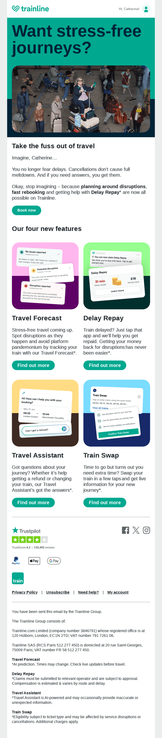
It is also helpful to begin with your brand colours. These should act as your base. From there, you can build a full scheme that supports your message without losing consistency.
Below are five common types of colour schemes that designers use in email marketing.
Monochromatic
A monochromatic scheme uses different shades, tints, and tones of a single colour. For example, you might use light blue for the background, medium blue for sections, and dark blue for text or buttons.
This approach creates a clean and unified look. It is easy on the eyes and works well for simple, focused campaigns. Because all colours come from the same base, there is little risk of clashing.
Monochromatic schemes are a strong choice for brands that want a calm, modern, and professional feel. They also help keep the reader focused on the content instead of the design.
Analogous
Analogous colours sit next to each other on the colour wheel, such as blue, blue-green, and green. These colours naturally blend well together and create a smooth visual flow.
This scheme is useful when you want your email to feel soft and harmonious. It avoids strong contrast, which makes it easier for readers to move through the content without distraction.
Analogous schemes work well for storytelling emails, newsletters, and content-heavy designs. However, since the colours are similar, you may need a stronger accent colour for buttons or key actions.
Complementary
Complementary colours are opposite each other on the colour wheel, such as blue and orange or red and green. This creates strong contrast and makes elements stand out clearly.
This scheme is very effective for highlighting important parts of your email. For example, you can use one colour for the background and the opposite colour for your call-to-action button. This makes the button easy to notice and click.
While complementary colours are powerful, they should be used carefully. Too much contrast can feel harsh. It is best to use one colour as the main base and the other as an accent.
Triadic
A triadic scheme uses three colours that are evenly spaced on the colour wheel. This creates a vibrant and balanced look without being too overwhelming.
This approach gives you more flexibility than simpler schemes. You can use one colour as the main focus and the other two as supporting colours. This helps create variety while keeping the design stable.
Triadic schemes are great for brands that want to appear creative, energetic, and modern. They work well in promotional emails, product launches, and campaigns that need strong visual interest.
Tetradic
A tetradic scheme uses four colours, made from two pairs of complementary colours. This creates a rich and diverse palette with many design options.
This scheme allows you to build more complex and dynamic email designs. You can highlight different sections with different colours while still keeping a structured look.
However, this approach requires careful balance. If all four colours are used equally, the design can feel chaotic. It is best to choose one dominant colour and use the others as accents.
Tetradic schemes are useful for larger campaigns, detailed layouts, or brands with a bold visual identity.
Key takeaways
Colour plays a powerful role in email marketing. It shapes how people feel, what they notice, and how they respond. When used correctly, it can improve both the look and performance of your emails.
The best results come from using colour with purpose. Keep your palette simple and balanced so your message stays clear. Always think about the emotions your colours create and how they match your campaign goal.
Consistency is also important. Using the same colours across your emails and brand builds trust and makes your content easy to recognize. At the same time, make sure your design is accessible, with strong contrast and clear readability for all users.
Your call-to-action should always stand out. A well-chosen colour can guide readers toward the next step and increase clicks.
Finally, test different colour combinations. Small changes can lead to better engagement and higher conversions over time.
The best colours are not just the ones that look good. They are the ones that help your message connect, guide attention, and drive action.
Read More: Avoiding the Email Naughty List: Why Inbox Filters Get Stricter During the Holidays