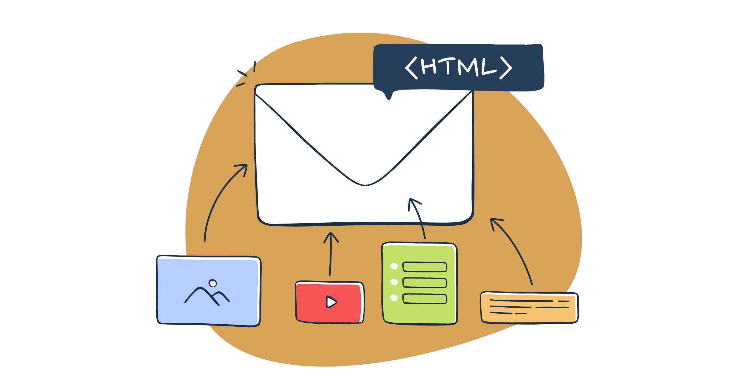
Email still plays a key role in digital marketing. It helps brands reach people in a direct and personal way. But building emails is not as simple as creating a web page. Email clients work very differently from modern browsers. This makes HTML email development a unique skill for developers.
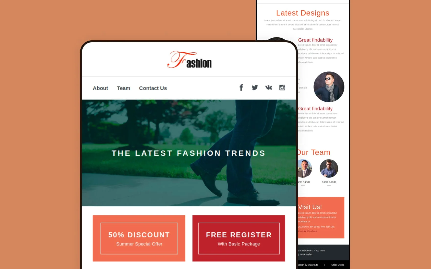
A responsive HTML email template is designed to look good on all devices. It adjusts to different screen sizes, from small mobile phones to large desktop screens. Today, many users open emails on their phones first. So, mobile-friendly design is no longer optional. It is a must.
Email developers also need to think about compatibility. Popular clients like Gmail and Outlook often display the same email in different ways. This can break layouts, hide images, or change fonts. Because of this, developers must follow strict coding practices. They often use tables for layout and inline CSS for styling.
This guide will walk you through the full process of creating a responsive HTML email template. You will learn how to build each part step by step. The goal is to help you create emails that are clean, readable, and reliable across all major email clients. By the end, you will understand how to handle common challenges and create templates that deliver a smooth user experience on any device.
HTML email development challenges
Building HTML emails is very different from building websites. Email clients follow their own rules. Many of them use old rendering engines and block modern features. Because of this, developers face many challenges while creating a clean and responsive email. Below are the most common issues you need to understand before you start.
Inconsistent rendering across email clients
One of the biggest problems in email development is inconsistent rendering. An email may look perfect in one client but break in another. For example, Gmail and Outlook use different rendering engines. Outlook even uses the Microsoft Word engine, which lacks support for many modern HTML and CSS features.
This means layouts, fonts, spacing, and images may appear differently across platforms. A button may shift position, or a background color may not show at all. Because of this, developers must write safe and simple code. Testing becomes very important. You cannot rely on one preview and expect the same result everywhere.
To handle this challenge, developers often use fallback styles and simple layouts. They also avoid complex CSS and rely on proven techniques that work across most clients.
Limited CSS support
HTML emails do not support full CSS like modern websites. Many email clients remove or ignore advanced CSS features. For example, properties like flexbox, grid, animations, and external stylesheets may not work.
Even basic CSS support can vary. Some clients ignore margin or padding. Others do not support background images or certain selectors. This limits design flexibility and forces developers to use older methods.
To deal with this, developers use inline CSS. This means adding styles directly inside HTML tags. It may look messy, but it ensures better compatibility. Simple properties like font size, color, and spacing work more reliably when written inline.
Developers also test each CSS rule carefully. If something breaks, they replace it with a safer option. This trial-and-error process is part of email development.
Handling responsive email template
Creating a responsive email is another major challenge. A responsive design adjusts based on screen size. But not all email clients support responsive techniques.
Some clients support media queries, while others ignore them. This makes it hard to create layouts that adapt smoothly. A design that works on mobile in one app may not work in another.
To solve this, developers use a hybrid approach. They combine fluid layouts with simple media queries. Fluid layouts use percentage-based widths instead of fixed sizes. This allows content to shrink or expand naturally.
In many cases, developers design mobile-first emails. This means the email looks good on small screens by default. Then they enhance it for larger screens where possible.
Handling different sizes
Emails are opened on many devices. These include phones, tablets, laptops, and desktops. Screen sizes can vary a lot. A layout that looks clean on a large screen may look cramped on a small one.
This creates a challenge in spacing, font size, and image scaling. Text may become too small to read. Images may overflow the screen. Buttons may be hard to tap.
To fix this, developers use flexible widths. They also use larger fonts and buttons for better readability. Images are set to scale within their containers. This ensures they adjust to the screen size.
Spacing is also important. Enough white space helps users read content easily on small screens. Every element must be placed carefully to avoid clutter.
Use of tables for layout
Modern web design avoids tables for layout. But in email development, tables are still widely used. This is because many email clients do not support modern layout systems like flexbox or grid.
Tables provide a stable structure. They help control alignment, spacing, and positioning. While they make the code longer and harder to manage, they ensure better compatibility.
Developers often use nested tables. This means placing tables inside other tables to create complex layouts. Each section of the email may have its own table structure.
Although this approach feels outdated, it is still the most reliable method for email design. Clean and well-structured tables help prevent layout issues across different clients.
Image blocking
Many email clients block images by default. Users must click to load them. If your email relies heavily on images, the message may not be clear at first glance.
This is a big challenge for marketers and developers. Important content may be hidden. Call-to-action buttons may not appear. This can reduce engagement.
To solve this, developers use alt text for images. Alt text shows a short message when images are blocked. It helps users understand the content.
They also use a mix of text and images. Key messages should always be written as text, not inside images. This ensures users can read the email even if images do not load.
Background colors and fallback styles are also used. These help maintain a clean design even without images.
Font compatibility
Fonts are another tricky area in HTML emails. Many email clients do not support custom web fonts. They only support a limited set of safe fonts like Arial, Times New Roman, and Verdana.
If a custom font is not supported, the email client will replace it with a default font. This can change the look and feel of your design.
To handle this, developers use font stacks. A font stack lists multiple fonts in order. If the first font is not supported, the next one is used.
For example, a developer may define a font stack like: Arial, Helvetica, sans-serif. This ensures the email still looks good even if the preferred font is not available.
Keeping font choices simple and readable is the best approach.
Inline styles requirement
Unlike websites, HTML emails cannot rely on external or internal stylesheets. Many email clients remove them. This makes inline styles necessary.
Inline styles are written directly inside HTML elements. For example, a paragraph tag may include its own font size, color, and spacing.
This ensures styles are applied correctly across most clients. However, it makes the code longer and harder to manage.
Developers often use tools to convert regular CSS into inline styles. This saves time and reduces errors. Still, manual checks are needed to ensure everything works as expected.
Inline styling is a key part of email development. Without it, designs may break in many clients.
Media query limitations
Media queries help create responsive designs. They allow developers to apply styles based on screen size. However, not all email clients support them.
Some mobile apps support media queries well. Others ignore them completely. This creates inconsistency in responsive behavior.
Because of this, developers cannot rely only on media queries. They must design emails that work even without them.
This is why fluid layouts and hybrid coding techniques are used. These methods ensure basic responsiveness without depending fully on media queries.
When media queries are supported, they can improve the design. But developers must always plan for cases where they do not work.
(Reminder) Test across multiple devices and clients
Testing is one of the most important steps in HTML email development. Since rendering is inconsistent, testing helps catch issues early.
Developers test emails on different devices, screen sizes, and email clients. This includes mobile apps, webmail, and desktop clients.
Tools can help automate testing, but manual checks are still useful. You need to see how your email looks in real conditions.
Testing also helps identify broken layouts, missing images, or incorrect fonts. Fixing these issues before sending improves user experience.
Skipping testing can lead to poor results. A broken email can harm your brand image and reduce engagement.
Accessibility considerations
Accessibility is often overlooked in email design. But it is very important. Emails should be easy to read and use for everyone, including people with disabilities.
This includes using clear fonts, proper contrast, and readable text sizes. Avoid very small text or low-contrast colors.
Developers should also use semantic HTML where possible. This helps screen readers understand the content. Adding alt text to images also improves accessibility.
Buttons should be large enough to tap on mobile devices. Links should be easy to identify. Clear structure helps users scan the email quickly.
Making emails accessible improves user experience for all readers, not just a few.
Tracking and analytics
Tracking email performance is another challenge. Marketers want to know if users open emails or click links. This helps measure success.
Tracking is usually done using small tracking pixels and tagged links. However, some email clients block tracking by default. This can affect data accuracy.
Privacy features in modern email apps also limit tracking. For example, some apps preload images, which can trigger false open rates.
Because of this, tracking data may not always be perfect. Developers and marketers must understand these limits.
To improve tracking, use clear call-to-action buttons and tagged links. Focus more on click data than open rates. Clicks often provide more reliable insights.
Combining analytics with good design helps improve email performance over time.
How to Develop HTML email template
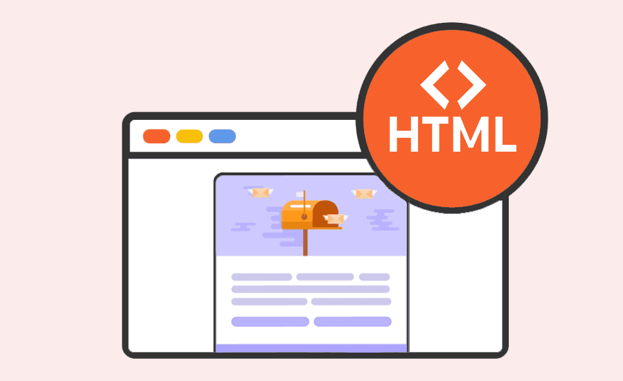
Creating a responsive HTML email template requires a clear process. Each part of the email must be built with care to ensure it works across all email clients. Below is a step-by-step guide to help you build a reliable and clean email template.
Step 1: Define DOCTYPE and language in the HTML file
Every HTML email starts with a proper structure. You need to define the DOCTYPE and set the language of the document. This helps email clients understand how to render your content.
Use a simple HTML5 DOCTYPE at the top of your file. It keeps your code clean and modern. After that, add the <html> tag with a language attribute like lang="en". This improves accessibility and helps screen readers.
Inside the <head> section, include basic meta tags. Set the character encoding to UTF-8. This ensures your text displays correctly. Also, include a viewport meta tag. It helps control how your email scales on mobile devices.
Even though email clients may ignore some head elements, adding them is still a good practice. It improves compatibility in clients that support them.
Exemplary snippet:
<!– HTML5 DOCTYPE –>
<!doctype html>
<html lang=”en”>
<head>
<title>Responsive Email</title>
<meta charset=”UTF-8″>
<meta name=”viewport” content=”width=device-width, initial-scale=1.0″>
</head>
<body>
<!– Email content here –>
</body>
</html>
Keep your structure simple. Avoid adding scripts or complex elements. Most email clients block them anyway.
Step 2: Build the header section
The header is the first thing users see when they open your email. It often includes your brand logo, name, or a short message.
In email development, the header is usually built using tables. This ensures consistent alignment across clients. Create a main table and place your header content inside it.
Add your logo as an image. Always include alt text. This helps users understand the content if images are blocked. Set a fixed width for the logo to avoid layout shifts.
You can also add a background color to the header. Use inline styles to apply it. This ensures better support across email clients.
Keep the header simple and clean. Avoid heavy images or large file sizes. A lightweight header loads faster and improves user experience.
Exemplary snippet:
<!DOCTYPE html>
<html lang=”en”>
<head>
<meta charset=”UTF-8″>
<meta http-equiv=”Content-Type” content=”text/html; charset=UTF-8″>
<meta name=”viewport” content=”width=device-width, initial-scale=1.0″>
<title>Welcome Email</title>
<style>
body {
margin: 0;
padding: 0;
font-family: Arial, sans-serif;
}
.email-container {
width: 100%;
max-width: 600px;
margin: auto;
}
</style>
</head>
<body>
<!– Email content goes here –>
<div class=”email-container”>
<!– Content –>
</div>
</body>
</html>
Spacing is also important. Use padding inside table cells to create enough space around elements. Avoid using margins, as they may not work in some clients.
Step 3: Design the body section
The body is the main part of your email. It holds all your content, including text, images, and buttons.
Start by creating a container table. This table should have a fixed width, usually around 600px. This is a common standard for email design. It ensures your content looks good on most screens.
Inside the container, use nested tables to structure your layout. Each section of your email can have its own table. This helps keep your design organized.
Use inline CSS to style your content. Set font sizes, colors, and line spacing directly inside HTML elements. This improves compatibility.
Make your design responsive by using fluid widths. Use percentages instead of fixed pixel values where possible. This allows your layout to adjust to different screen sizes.
Keep your content easy to read. Use short paragraphs and clear headings. Add enough spacing between sections. This helps users scan the email quickly.
Exemplary snippet:
<body>
<div style=”text-align: center;”>
<!– Core email container –>
<table width=”100%” border=”0″ cellspacing=”0″ cellpadding=”0″ bgcolor=”#f7f7f7″>
<tr>
<td align=”center”>
<!– Content table –>
<table width=”600″ border=”0″ cellspacing=”0″ cellpadding=”0″ class=”email-container”>
<tr>
<td style=”padding: 20px; background-color: #ffffff;”>
<!– Header Section –>
<h1>Welcome to Our Newsletter!</h1>
</td>
</tr>
<!– Additional rows go here –>
</table>
</td>
</tr>
</table>
</div>
</body>
Also, avoid placing important information inside images. Always use real text for key messages.
Step 4: Add email content
Content is the heart of your email. It should be clear, useful, and easy to understand.
Start with a strong headline. This grabs the reader’s attention. Follow it with a short introduction that explains the purpose of the email.
Use simple language and short sentences. This improves readability on small screens. Break your content into sections using headings and spacing.
Add images to support your message. But do not rely on them fully. Always include alt text. This ensures your message is still clear if images do not load.
Buttons are also important. They guide users to take action. Create buttons using table-based structures. Style them with background colors and padding.
Make sure your buttons are large enough to tap on mobile devices. Use clear and simple text like “Learn More” or “Get Started.”
Exemplary snippet (with content and a button)
<!– Content Block –>
<tr>
<td style=”padding: 15px; font-size: 16px; color: #333;”>
Hello! We’re excited to have you on board. Here’s what you can expect from us.
</td>
</tr>
<!– Button Block –>
<tr>
<td align=”center”>
<table border=”0″ cellspacing=”0″ cellpadding=”0″>
<tr>
<td style=”background-color: #007BFF; padding: 10px 20px; border-radius: 5px;”>
<a href=”https://example.com” style=”color: #ffffff; text-decoration: none; font-size: 16px;”>Get Started</a>
</td>
</tr>
</table>
</td>
</tr>
Links should be easy to spot. Use a different color or underline them. This helps users know where to click.
Always test your content for clarity. Read it on both desktop and mobile screens. Make sure it looks clean and easy to follow.
Step 5: Create the footer section
The footer is the final part of your email. It provides important information and builds trust with your audience.
Start by adding your company details. This may include your name, address, and contact information. Many email laws require this information.
Add an unsubscribe link. This is very important. It allows users to opt out of your emails easily. Not including it can harm your sender reputation.
You can also include social media links. These help users connect with your brand on other platforms. Use simple icons and keep them small.
Like other sections, the footer should be built using tables. Use inline styles for spacing and colors.
Exemplary snippet:
<!– Footer Section –>
<tr>
<td style=”padding: 20px; font-size: 12px; text-align: center; color: #999;”>
You received this email because you signed up for updates.
<br>
<a href=”https://example.com/unsubscribe” style=”color: #007BFF; text-decoration: none;”>Unsubscribe</a> |
<a href=”https://example.com/privacy-policy” style=”color: #007BFF; text-decoration: none;”>Privacy Policy</a>
<br><br>
Follow us:
<a href=”https://twitter.com” style=”color: #007BFF; text-decoration: none;”>Twitter</a> |
<a href=”https://facebook.com” style=”color: #007BFF; text-decoration: none;”>Facebook</a>
</td>
</tr>
Keep the design simple. Use smaller font sizes, but make sure the text is still readable. Avoid cluttering the footer with too much information.
A clean and clear footer improves user trust and keeps your email compliant with best practices.
Bonus tip: Using an HTML email editor
Building emails from scratch can take time. It also requires strong coding skills. This is where HTML email editors can help.
Email editors provide ready-made templates and drag-and-drop tools. They make it easier to design emails without writing full code.
Some editors also handle inline CSS automatically. This saves time and reduces errors. They often include built-in testing features as well.
Tools like Stripo and BeeFree are popular choices. They allow you to design emails visually and export clean HTML code.
Even if you use an editor, it is good to understand the basics of HTML email development. This helps you fix issues and customize templates when needed.
Editors are great for speed and ease. But manual coding gives you full control. Choose the method that fits your workflow best.
Wrapping up
Developing a responsive HTML email template takes time and attention to detail. It is not like building a regular web page. You must work within strict limits and follow tested methods.
Each step plays an important role. From setting up the structure to designing the layout and adding content, everything must be done carefully. Using tables, inline styles, and simple designs helps improve compatibility.
You also need to focus on user experience. Emails should be easy to read, quick to load, and clear on all devices. Mobile-friendly design is now essential, not optional.
Testing is just as important as building. Always check your email across different clients and screen sizes. This helps you catch issues before sending.
Using tools and editors can make the process easier. But understanding the core principles gives you better results in the long run.
Read More: Best 8 WordPress Transactional Email Plugins Reviewed