Email newsletters are still one of the most effective ways to build direct relationships with your audience, drive engagement, and convert readers into customers. But in today’s crowded inbox environment, success is no longer just about what you say—it’s about how your message is designed and delivered visually.
Modern subscribers don’t read emails word by word. They scan. In just a few seconds, they decide whether to open, engage, or delete. That means your newsletter design must immediately communicate clarity, relevance, and value.
A strong email newsletter design does three things at once:
- Grabs attention quickly through layout and visual hierarchy
- Makes content easy to scan and understand
- Guides readers toward a clear action (click, read, or buy)
Design is not decoration—it is communication structure. Every spacing choice, color, font, and image either supports or weakens your message.
Choose an email newsletter template that fits your content
The foundation of a successful email newsletter starts with selecting the right template. A template is not just a visual shell—it defines how your message flows and how easily readers can absorb it.
A well-chosen template should match your content type and communication goal. For example, a promotional campaign needs a more conversion-focused layout, while a content newsletter benefits from a clean, editorial-style structure.
Focus on structure before style
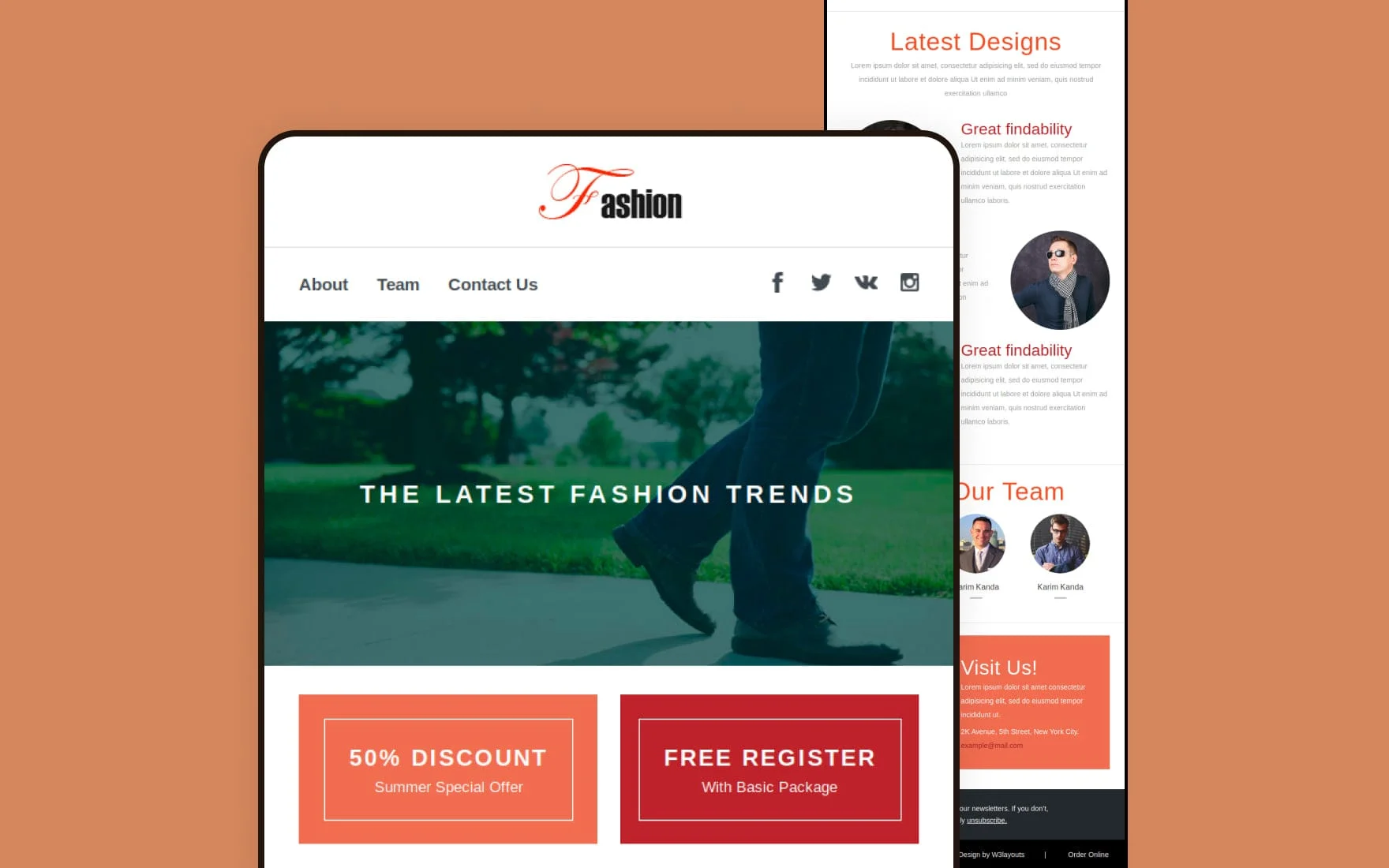
Effective newsletter templates typically follow a predictable flow:
- Header (brand identity and logo)
- Hero section (headline + key message)
- Body content (supporting information or updates)
- Call-to-action (primary action button or link)
- Footer (contact details and unsubscribe option)
This structure works because it mirrors how readers naturally scan content—from top to bottom, in a clear progression.
Prioritize readability and responsiveness
Your template must also be designed for real-world viewing conditions:
- Most emails are opened on mobile devices
- Single-column layouts perform best for mobile readability
- Content should remain scannable without zooming or horizontal scrolling
A good rule is to keep designs simple enough that a reader can understand the message in under 10 seconds.
Match template to intent
Different goals require different layouts:
- Promotional emails: Strong CTA placement and minimal distractions
- News updates: Structured sections and clear hierarchy
- Content newsletters: More breathing space and editorial formatting
Choosing the right template ensures your message is not only visible but also easy to act on.
Make it yours by incorporating your branding
Once the structure is in place, the next step is making your newsletter instantly recognizable. Branding is what turns a generic email into a consistent brand experience.
Strong branding builds trust and helps subscribers immediately identify who the message is from—even before reading the content.
Use consistent visual identity
Your email newsletter should consistently reflect your brand through:
- Logo placement (typically header area)
- Brand color palette (used for buttons, accents, and highlights)
- Typography (consistent font styles across emails)
- Visual tone (images, icons, and illustration style)
Consistency in these elements strengthens recognition and long-term engagement. When readers repeatedly see the same visual identity, they associate it with reliability and professionalism.
Apply hierarchy through brand styling
Branding is not just aesthetic—it also supports communication hierarchy:
- Headings should stand out using bold or larger type
- Primary actions (CTAs) should use accent brand colors
- Secondary information should remain visually subtle
This helps guide readers toward the most important message without overwhelming them.
Keep branding clean and intentional
Modern email design trends favor simplicity over complexity. Overloading emails with multiple fonts, colors, or decorative elements can reduce readability and distract from the message.
Instead:
- Stick to 1–2 font families
- Use a limited color palette
- Maintain consistent spacing and alignment
A clean branded design ensures your message stays the focus while still reinforcing your identity.
Chart your reader’s journey with design elements
A high-performing email newsletter is not just a collection of content blocks—it is a guided reading experience. Every design decision should intentionally lead the reader from the first impression to the final action. This is what “charting the reader’s journey” means: using structure, hierarchy, and visual cues to control attention flow.
Modern email design relies heavily on visual hierarchy, directional flow, and conversion-focused layout patterns to make this journey intuitive and frictionless.
Set a hierarchy to highlight key points
Visual hierarchy is the foundation of effective email design. It ensures readers instantly understand what matters most without needing to read everything in order.
In practice, hierarchy is created through:
- Typography scale (larger headlines, smaller body text)
- Color contrast (highlighting key elements like buttons or offers)
- Spacing and grouping (separating important sections clearly)
- Weight variation (bold vs regular text for emphasis)
These elements guide the reader’s eye in a predictable order: headline → supporting content → action.
A widely used structure is the inverted pyramid model, where attention naturally narrows toward a single action point. This ensures that even skim readers reach the most important message without effort.
When hierarchy is done well, readers don’t “search” for meaning—the design tells them what matters first, second, and third.
Lead readers through a longer email with eye-catching elements
For longer newsletters, maintaining attention requires more than a strong opening. You need visual signposts that keep readers engaged as they scroll.
Effective techniques include:
- Section dividers: Clearly separate topics so readers can mentally reset between ideas
- Highlight boxes or accent backgrounds: Draw attention to key insights or offers
- Directional cues: Arrows, spacing flow, or aligned elements that subtly guide movement
- Strategic imagery: Used to break monotony and reinforce meaning, not just decorate
These elements work together to prevent “scroll fatigue,” where readers drop off mid-email. Research-backed email design practices show that breaking content into structured, visually distinct sections significantly improves readability and engagement.
The goal is simple: each scroll should feel like a natural next step, not a visual reset.
Always highlight CTAs
The call-to-action (CTA) is the most important conversion point in your entire email. No matter how strong your content is, if the CTA is unclear or visually weak, engagement drops.
To make CTAs effective, focus on three core principles:
1. Visual dominance
CTAs should stand out through contrast, size, and spacing so they are instantly recognizable as clickable.
2. Strategic placement
Place at least one CTA above the fold and repeat it naturally at the end of the email for scrollers.
3. Action-driven language
Use clear, benefit-oriented wording such as “Get the guide,” “Start free trial,” or “Download now,” instead of vague phrases like “Click here.”
Well-designed CTAs reduce friction by making the next step obvious. Studies consistently show that emails with a single, clearly emphasized CTA perform significantly better than cluttered designs with competing actions.
Your CTA should never feel like a choice the reader has to search for—it should feel like the most natural continuation of the message.
Shoot for a simple presentation
Simplicity is one of the most powerful design principles in email marketing. A clean, uncluttered layout improves readability, reduces cognitive load, and helps subscribers focus on what actually matters—your message.
Modern email environments are fast-scanning and mobile-first, meaning simplicity is no longer a stylistic choice; it is a performance requirement.
Give your content space to breathe
White space (or negative space) is not empty—it is a design tool for clarity.
Proper spacing helps you:
- Improve readability by separating content blocks
- Reduce visual overwhelm on small screens
- Emphasize important elements like headlines and CTAs
- Create a more premium, organized feel
When content is crowded, readers struggle to identify priorities. When spacing is generous and intentional, the message becomes easier to process and trust.
A clean layout naturally guides the eye and ensures that each section gets its own moment of attention instead of competing for it.
Strike the right balance with image and graphics
Images and graphics are powerful, but only when used strategically. Overuse can slow down load times, distract from messaging, or reduce clarity—especially on mobile devices.
A strong balance means:
- Using images to support meaning, not replace text
- Avoiding overly heavy visual layouts that overshadow copy
- Keeping a healthy text-to-image ratio for readability and deliverability
- Ensuring visuals reinforce hierarchy rather than disrupt it
In modern email design, the most effective newsletters often combine clean typography with minimal but purposeful visuals, ensuring the message stays in control while design enhances understanding.
The key is restraint: every image should earn its place by improving clarity, engagement, or emotional impact—not just filling space.
Don’t forget basic design principles
Even the most creative email newsletter will fail if it ignores the fundamentals. Basic design principles ensure your email is not only visually appealing but also accessible, readable, and functional across all devices and email clients. In 2026, with stricter accessibility expectations and mobile-first behavior dominating email usage, these fundamentals are more important than ever.
Make your email responsive:
A responsive email adapts automatically to different screen sizes—especially mobile devices, where most emails are now opened.
To ensure responsiveness:
- Use a single-column layout for consistent rendering across devices
- Keep email width typically around 600px max for desktop scaling
- Use scalable images with flexible widths (so they resize properly)
- Design with mobile-first thinking, ensuring content remains readable on small screens without zooming or horizontal scrolling
Responsive design is essential because email clients render content differently, and poorly optimized layouts often break on mobile or Outlook-style clients.
The goal is simple: your email should feel effortless to read whether it’s opened on a phone, tablet, or desktop.
Stay within the bounds of the template:
Templates provide structure—and breaking them often breaks readability.
To maintain consistency:
- Avoid adding overly wide elements that overflow the layout
- Keep images and text aligned within the defined grid
- Stick to the template’s spacing rules instead of forcing custom layouts
- Test how your design behaves in multiple email clients before sending
Most modern email templates are built to ensure predictable rendering. Staying within their boundaries helps avoid broken layouts, misaligned sections, or awkward scrolling issues that reduce engagement.
Add alt text to all functional images:
Alt text is no longer optional—it is a core part of both accessibility and usability.
Always include descriptive alt text for:
- Images that contain information (charts, banners, product visuals)
- Buttons or clickable image-based CTAs
- Icons that support meaning
Alt text ensures your message still makes sense even if images are blocked or fail to load. It also improves accessibility for users relying on screen readers. In modern email standards, accessibility compliance is becoming a key requirement for effective communication and deliverability.
Good alt text should be:
- Clear and descriptive
- Short but meaningful
- Focused on purpose, not decoration
Present key information textually:
One of the most important modern email design principles is: never rely only on visuals to communicate critical information.
Instead:
- Always include important messages in live text (not embedded in images)
- Ensure users can understand the email even with images disabled
- Keep CTAs, offers, and key details readable in plain text format
This improves both accessibility and performance because many email clients block images by default. It also ensures your message remains intact in all conditions.
Keep font and color use minimal:
Too many fonts or colors can quickly make an email feel chaotic and unprofessional.
Best practice is:
- Use 1–2 font families maximum
- Stick to a small, consistent color palette (usually aligned with your brand)
- Use color only to guide attention, not to decorate unnecessarily
- Reserve bold or accent colors for CTAs and key highlights
Minimal styling improves clarity and reduces cognitive load, helping readers focus on your message rather than the design itself.
Clean, restrained design also improves trust—especially in marketing emails where clarity often influences engagement decisions.
Use web (or web-safe) fonts:
Fonts play a major role in readability and consistency across email clients.
Because not all email platforms support custom fonts, it’s important to prioritize compatibility:
- Use web-safe fonts like Arial, Helvetica, Georgia, or Verdana for maximum reliability
- If using web fonts, always include fallback fonts in your font stack
- Keep typography large enough for mobile readability (typically 14–16px minimum for body text)
Web-safe fonts ensure your email looks consistent everywhere, while fallback systems prevent broken or unreadable text when custom fonts are unsupported.
Good email newsletter design speaks for itself
Great email newsletter design doesn’t try to impress—it quietly guides the reader toward understanding and action. When structure, hierarchy, simplicity, and accessibility work together, the design becomes invisible and the message becomes clear.
The most effective newsletters today share a few common traits:
- They are easy to scan in seconds
- They prioritize clarity over decoration
- They guide attention with strong visual hierarchy
- They are fully responsive and accessible
- They make the next step obvious through well-placed CTAs
Ultimately, good design removes friction. It ensures your audience doesn’t have to “figure out” your message—they simply receive it, understand it, and act on it.
In a crowded inbox, that clarity is what makes your newsletter stand out.
Read More: Why AI belongs inside the email creation process, not just the analytics dashboard